Project Overview
This project was born from the frustration of shopping at my local food store. As a user of their app and scanner, I was constantly finding hiccups that made my customer journey more complex than it needed to be. After talking to people about this I realized that I was not the only one. Which is why I decided to improve the user experience.
My contributions
Identifying the problem areas
User interviews
Survey
Identifying the user journey
Wireframing
Prototyping
Testing
The design process

Purpose
As UX designers we work on a lot of different projects, but many of them are not projects we are able to share with the world. In order to create something that I'm passionate about and able to share the full process I created this personal project.
The research
The research for this project consisted of a survey, user interviews, user observation and a competitior analysis.
Survey
The survey was an online survey that consisted of 30 participants, between the ages of 18-50 years. It was a split between 60% females and 30% males.
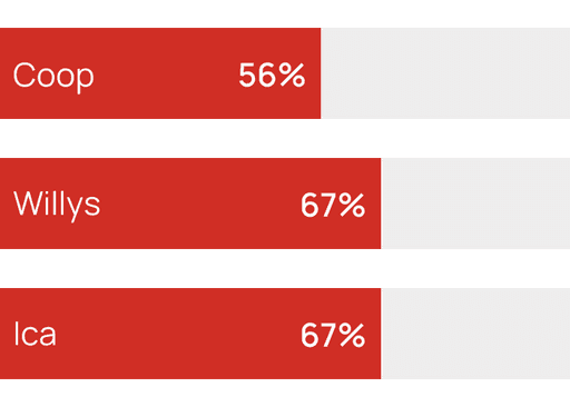
Willys, Ica & Coop are the top 3 popular stores
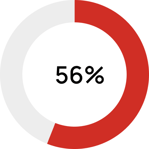
56% use their stores app at least once a week
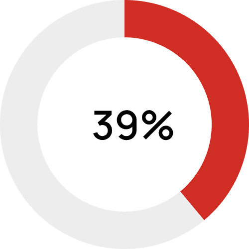
39% checks for offers in the
app
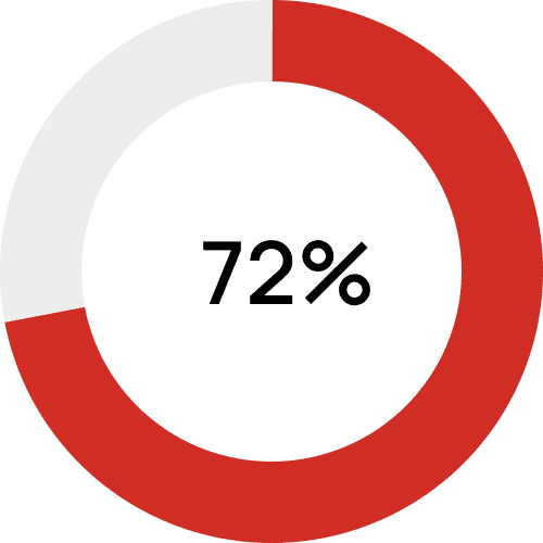
72% uses the hand-scanner when shopping
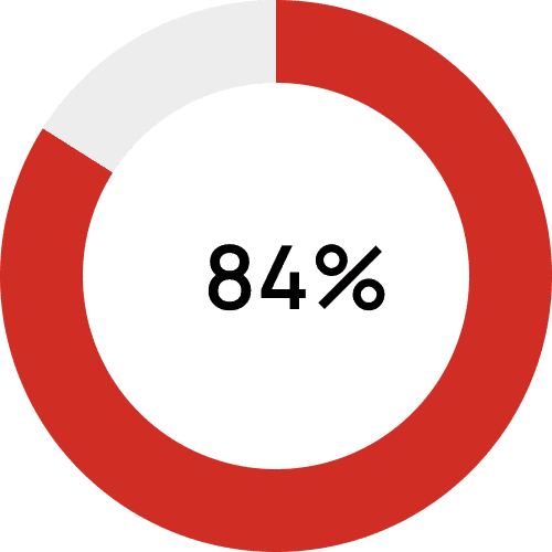
84% bring their own bags, 70% of those bring 1-2 bags
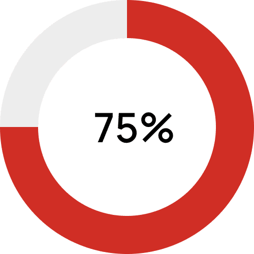
75% uses the rolling
basket
User interviews
User interviews were done with 3 participants. 2 females and 1 male between the ages of 25-40. 2 of them used the app regularly, and one did not.
Users stated how they like the big pictures and the app was clearly showing how many discounted items they are able to buy. However, all 3 participants struggled with adding things to the shopping list from the offers page and the shopping list itself.
User observation
I also followed along with the participants' journey when shopping.
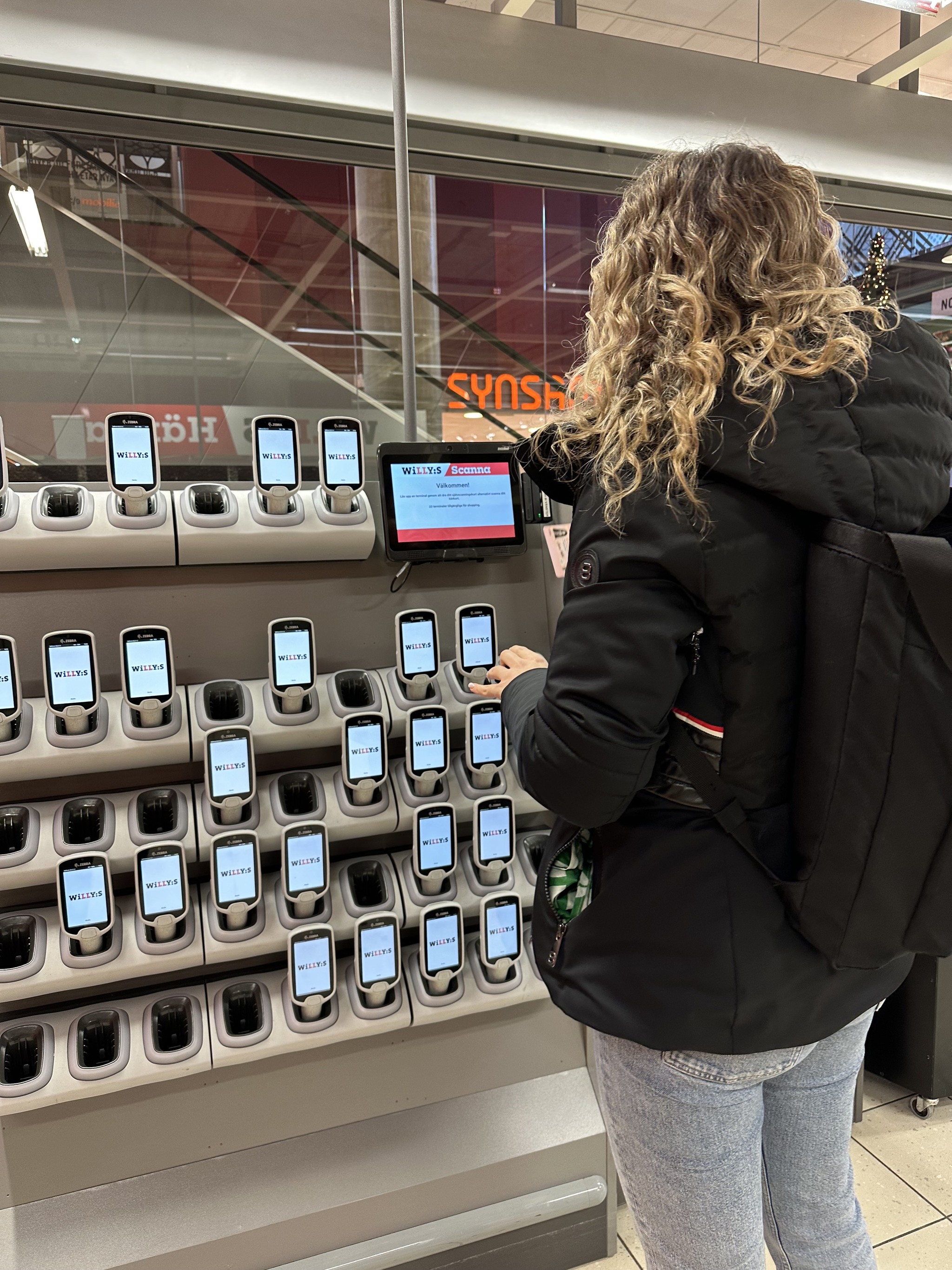
User first needs to scan their ID card
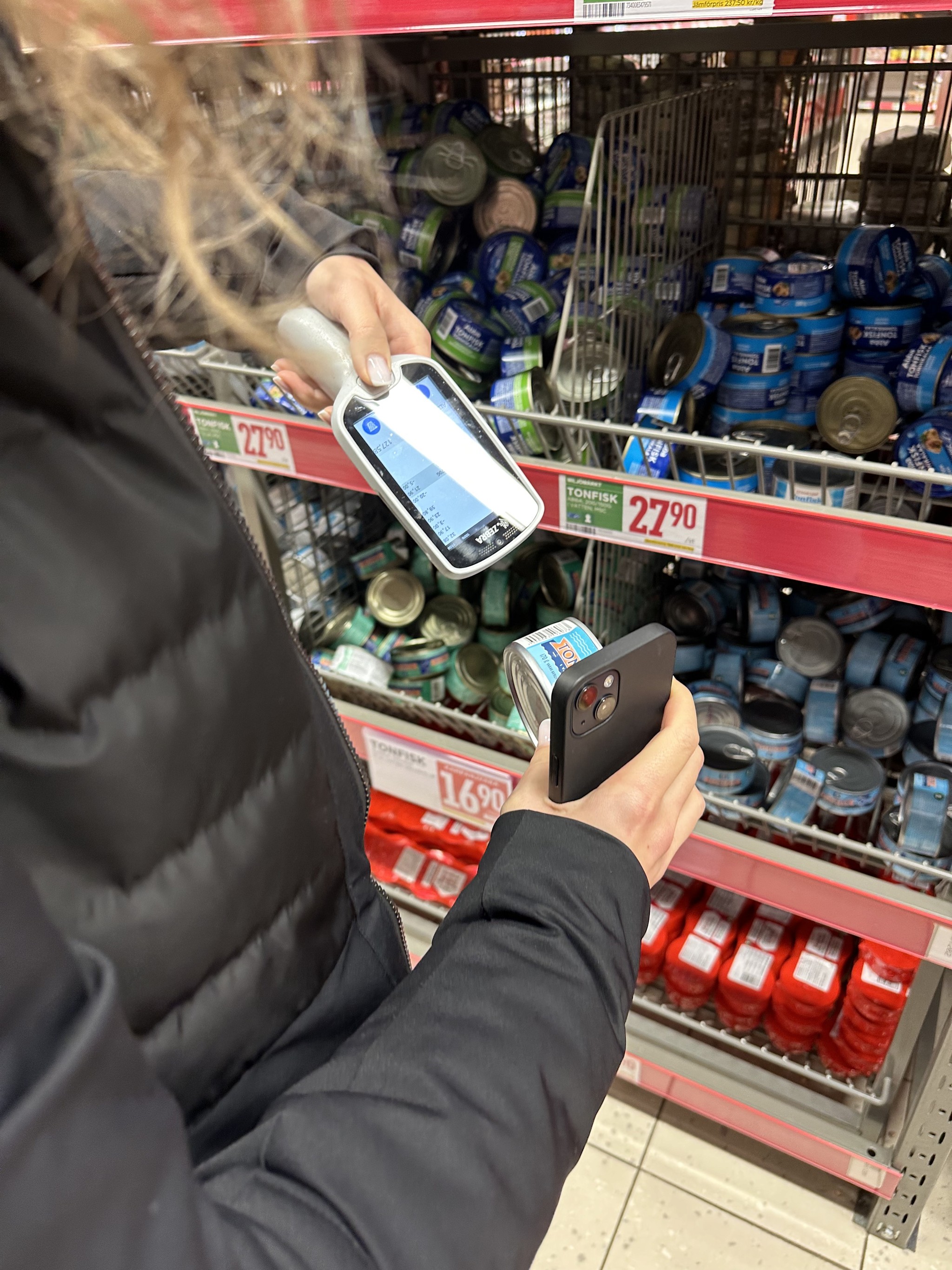
User scanning the product while holding the mobile phone, hand scanner and item
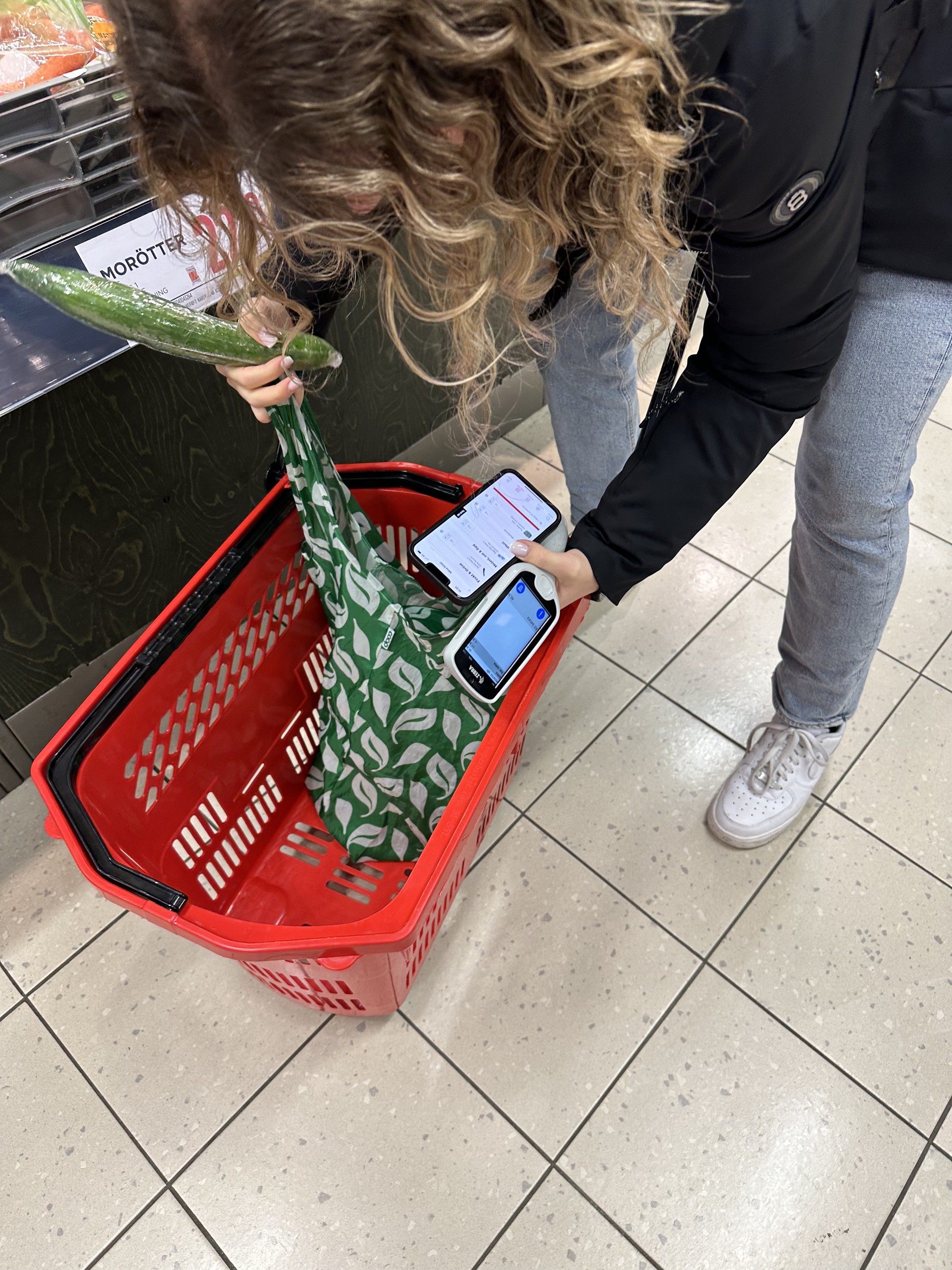
The user struggling to put an item in the bag while holding the scanner and her mobile phone
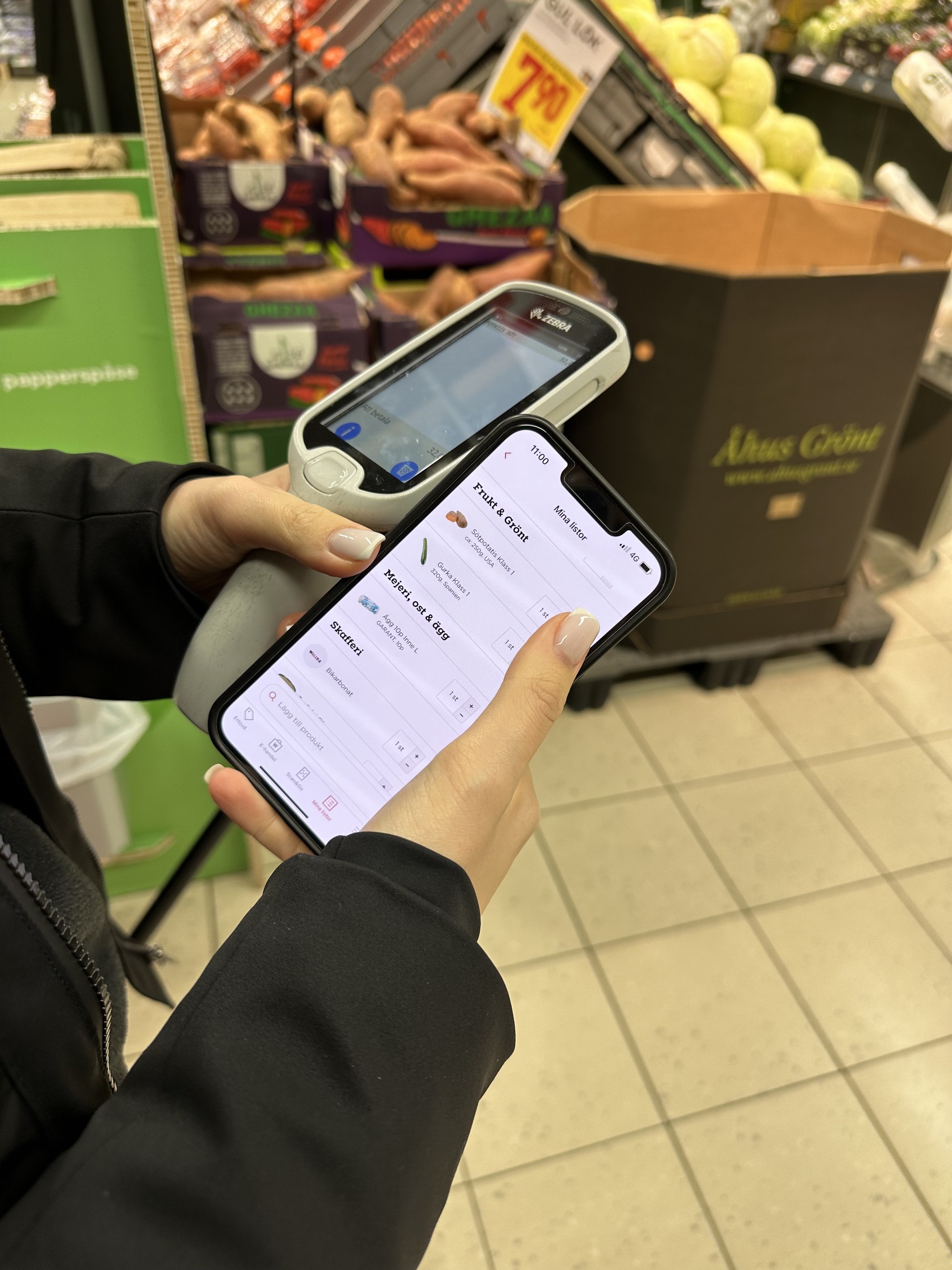
The user needs to delete things off the shopping list to check them off
The problems
Adding things to the shopping list from the offers section and the shopping list is confusing and time-consuming.
Holding the phone, and scanner and picking out items in the store all at the same time leads to frustration and confusion.
Removing things from the shopping list instead of checking them off while at the store.
Currently if a user forgets their ID card that means that they cannot use the hand scanner
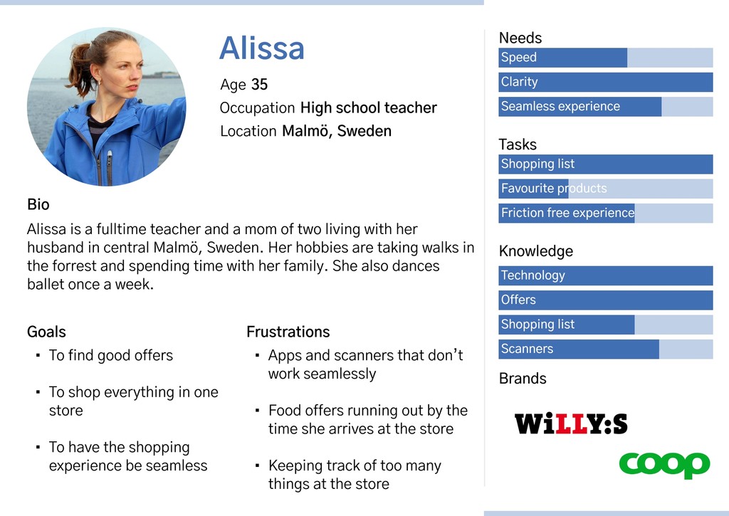
The persona
From the research that was conducted a persona was created. To be able to focus this project on a specific target group only one persona was created in this instance.
Customer journey map
A customer journey map was created to identify the problems and frustrations the user had throughout the journey.
Wireframes
Paper wireframes were drawn to solve the issues that the users were facing. A redesign of the app was done but a new and improved rolling basket was also created.
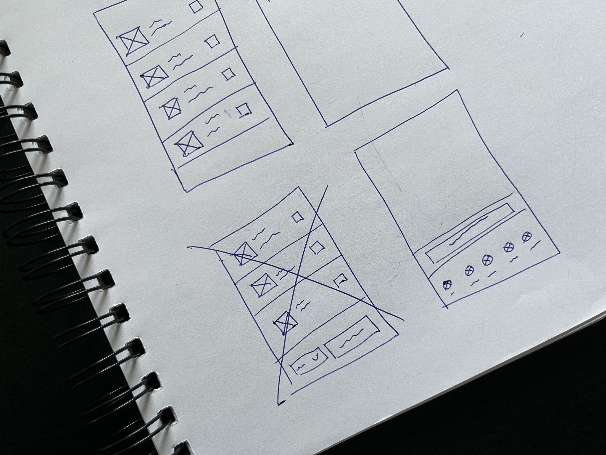
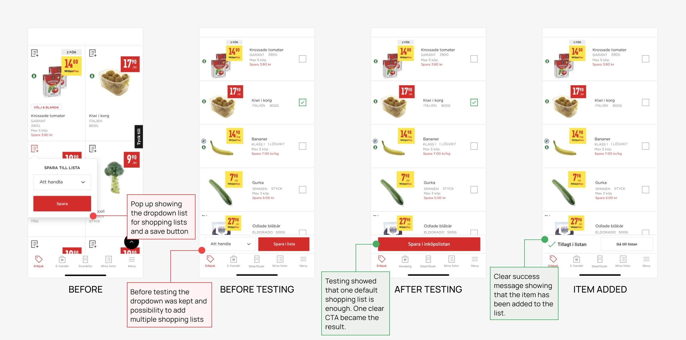
Wireframes showing the new list of offers. User testing showed that one shopping list is enough so the dropdown option was removed.
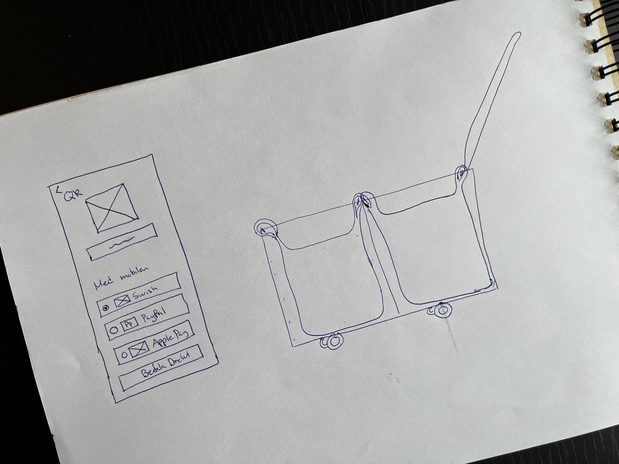
A wireframe showing the new checkout screen and also the design of the new cart viewed from the side
Prototype
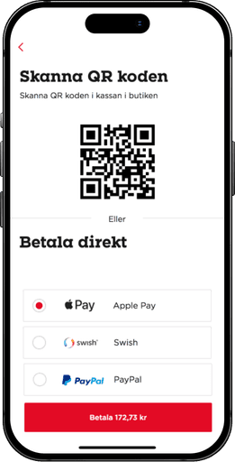
To test out the new flow, a prototype was created.
Testing
When the prototype was sufficient for testing I went back to the 3 people that were part of the interviews and tested the prototype on them to validate the changes. The new user journey was also recreated with one of the participants. The test validated the changes and a smaller iteration was done. Overall the frustration went time and shopping became faster.
The concept
The final concept is a redesign of the app but it's also a new and improved basket that allows the user to walk into the store right away, scan the basket, place their bags properly and start shopping. The basket scans the items without the user needing to scan them and payment is done easily through the phone.
Below will follow the redesign of the app and the new and improved basket.
The new customer journey map
A new customer journey map was created to showcase how the journey improves with the redesign and the new basket. The greyed-out dots are the steps that would disappear in the new journey. The step that was not addressed was discounted items that have run out in the store. With further research there could be an option to add the number of items in the store to the 'Offered' section in the app, however, due to time limitations, this was not done in this project.
Before entering the store
Offers
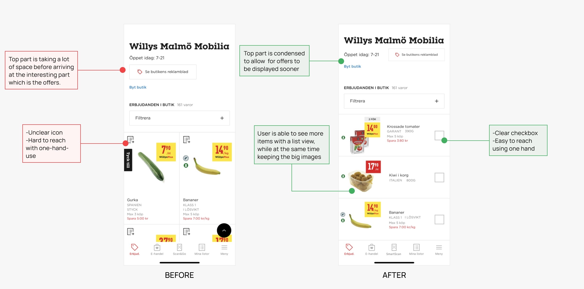
The 'Offers' section was changed to a list view and the confusing icon was changed to checkboxes instead.
Adding items to the shopping list - from the offers page
Adding items to the shopping list became easier by having one default shopping list as the research showed that people do not use more than one shopping list.
Search
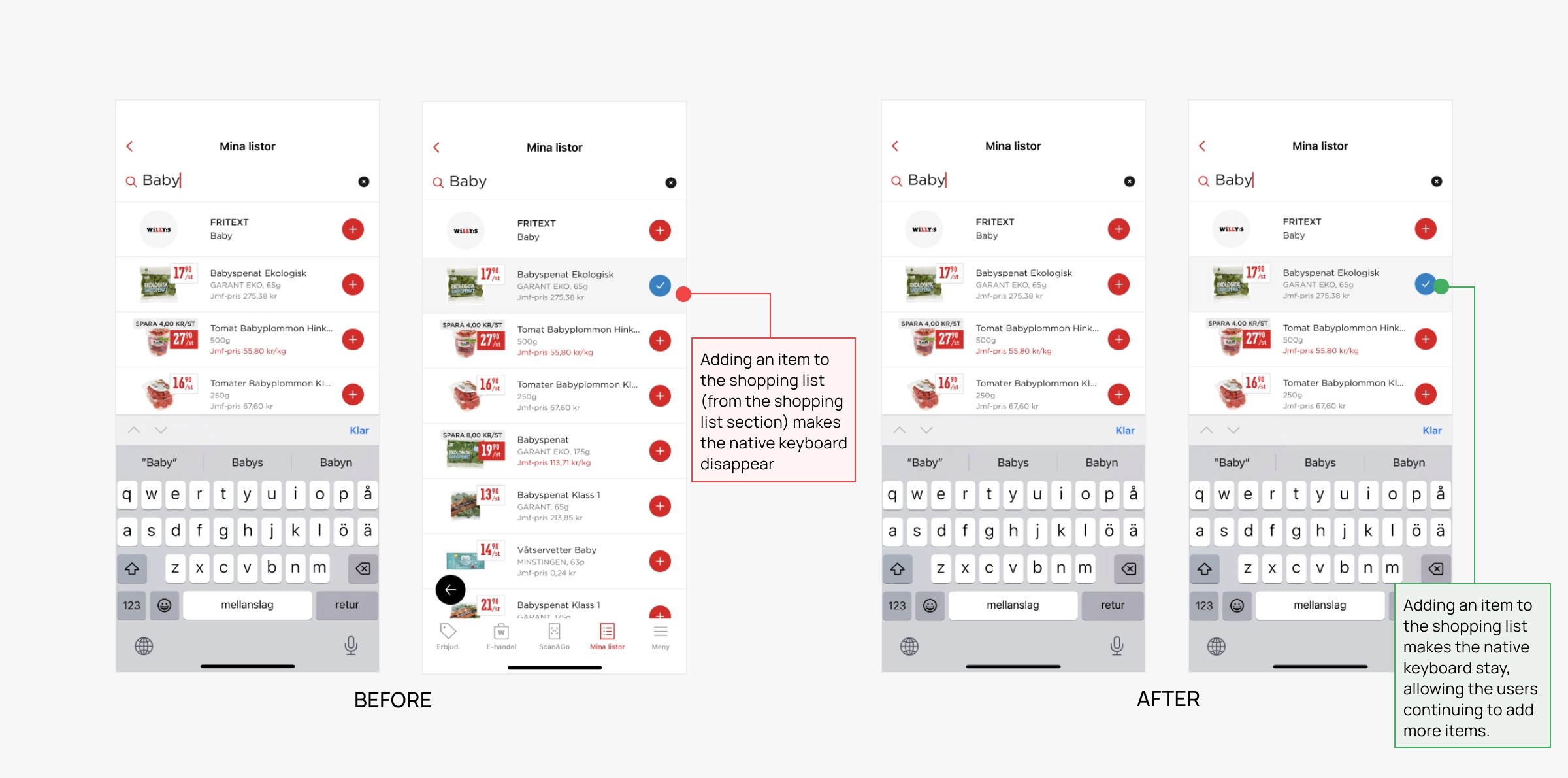
Searching for an item to add to the shopping list previously displayed some usability issues. With the redesign, the native keyboard stays and the user can continue adding items to the list.
Favorites
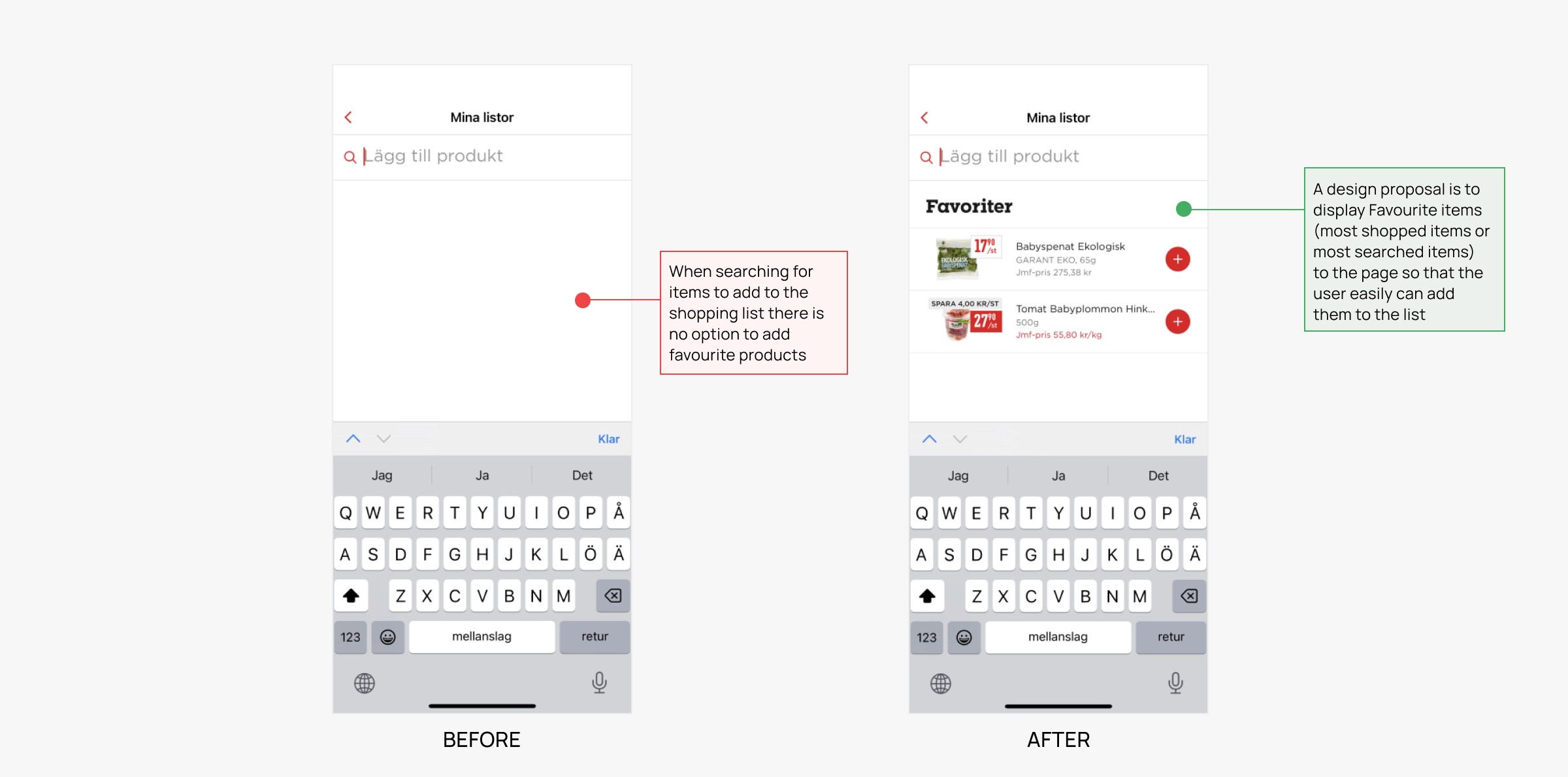
The screen where users are able to add items to the shopping list was previously showing an empty page. With the redesign, the page would instead be populated with the users' favorite products. This could be products that are most shopped for or mostly added to the list.
At the store
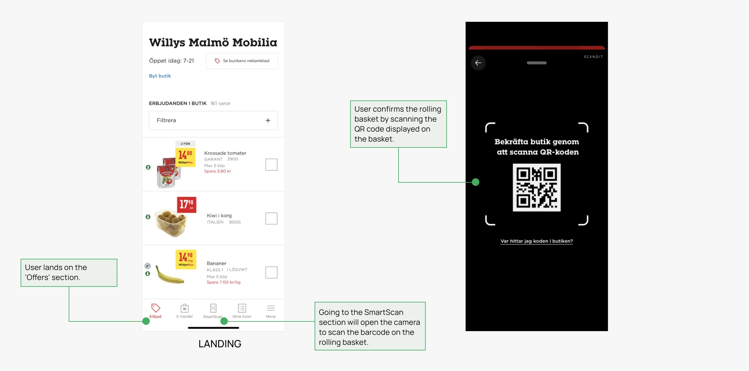
Scanning the rolling basket
To start shopping the user could with the new concept walk straight into the store, scan the rolling basket and start shopping.
My shopping list
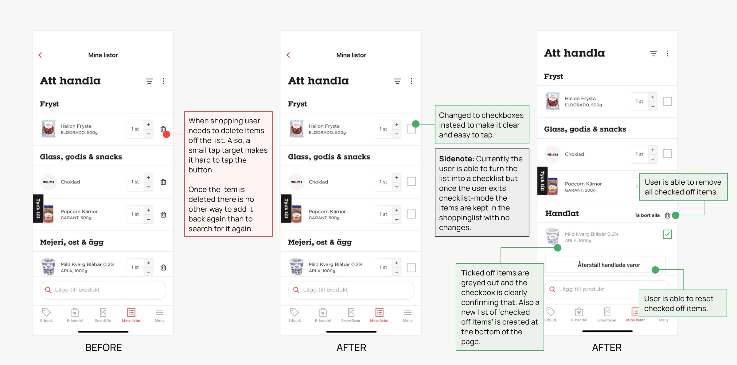
Accessing the shopping list would be easy on a mobile phone. Some improvements were made to the list one of them being the change of the delete buttons. They were changed to checkboxes instead and when having something checked off the item would go to a 'Checked off' list at the bottom of the page. To delete an item the user would swipe left on the item instead.
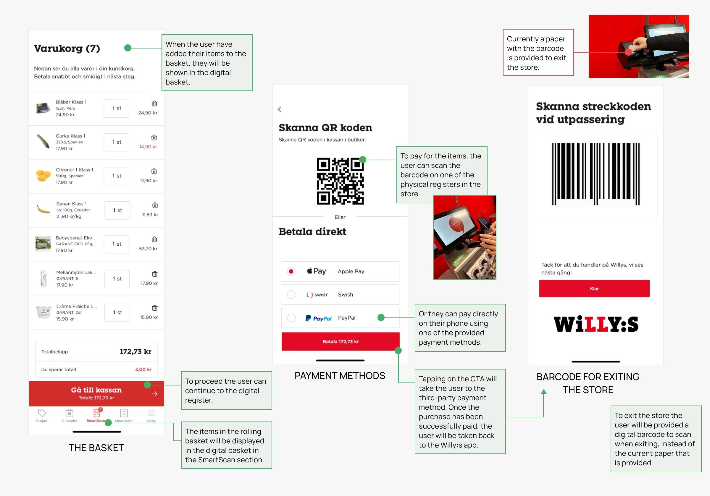
The digital basket
Once the user has added all their items to the bag they can access their digital basket in the app. To leave the store they can pay using their mobile phone or one of the physical registers in the store.
The new rolling basket
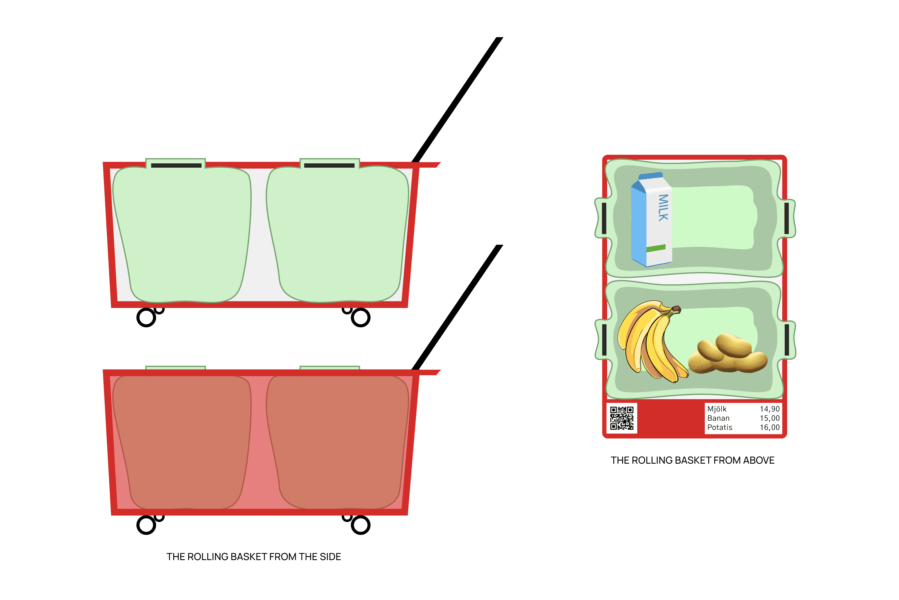
Since the rolling basket was the most used item to carry items in the store that is the product that got the new and improved look. The new rolling basket has a unique QR code that the user scans with their phone upon entering the store. The basket uses a 3D camera and scanning sensors to register the products being added to the basket. It also has a small display with large text displaying the three latest items so that the user can quickly glance to see that the correct product has been scanned.
The basket allows the user to hook their bags to the basket so that they easily can place their items inside without any hassle. Since most users bring 1-2 bags the basket is comfortably able to store two bags.
Final thoughts
Through research, testing and understanding the users' needs I was able to come up with a solution that not only would benefit the user but also the business. The need for scanners would lower and time spent in the store would decrease which would lead to users coming back more frequently as the shopping experience becomes more seamless.
This was a creative project that was not having any technical limitations. The new rolling basket would need further research to understand which sensors and cameras would be suitable however for this project only a prototype was created.
