Project Overview
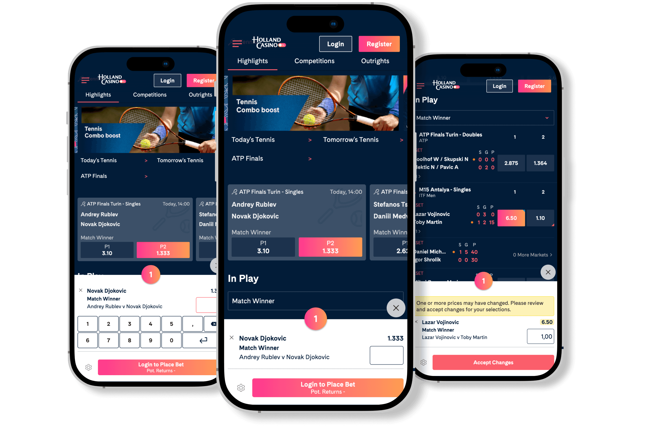
Another big feature I did while working in the sports betting industry is research and design the feature Quick Single Betslip on the sportsbook. This is one that was highly requested bythe customers and one that would make a great impact on th e sportsbook. The feature itself is a quicker check-out for single bets only.
My contributions
Lead designer throughout the project
Analyzing requirements
Gather research findings
Design concept mockups
Validate design with user tests
Design high fidelity prototype following the company’s branding and design system
The design process


The team
The team consisted of three UX designers and three UI designers, one product owner and one project manager and multiple developers. I was the lead designer of this project and I did the majority of the work with review sessions and input from the other designers.
Purpose
This was a feature highly requested by the customers as user data showed that there was a significant group of users who only placed single bets (one bet for one selection) on in-play events. To be able to cater to this group the Quick Single Betslip (QSB) project was created. The QSB is essentially a smaller and quicker check-out for single selections bets only.
Using the regular bigger betslip meant that time could be wasted as there were more features to be covered which could result in odds being changed (this can happen a lot during in-play events). Which is why the need for a smaller and quicker one was high.
User research
User test on competitor
To get an understanding of the feature a user test was done on three employees on a competitor site. This gave us insights into how this feature can be used and what was working on the customers' sites and what could be improved.
Competitior analysis
A competitor analysis was also done to understand how different sportsbooks have designed this feature. Looking at the functionality it seemed as if most sportsbooks turned the quick betslip into an overlay and kept it as small as possible with the ability to use the site behind.
Key insights
1.
Most competitors used an overlay styling
2.
A few competitors combined the quicker betslip with the bigger one
Defining
From our tests and competitor analysis, we understood how to lay out the designs. However, since this was a feature that we needed to consider tax laws a clear understanding of the different visuals was set in place.
Ideation
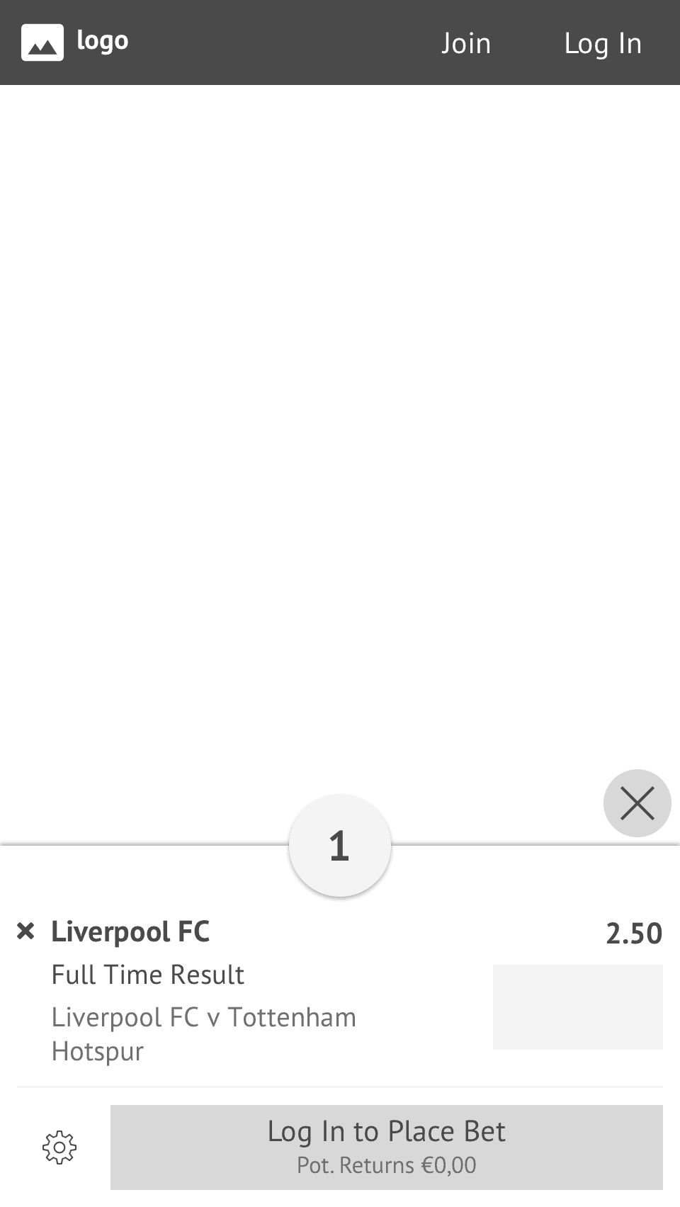
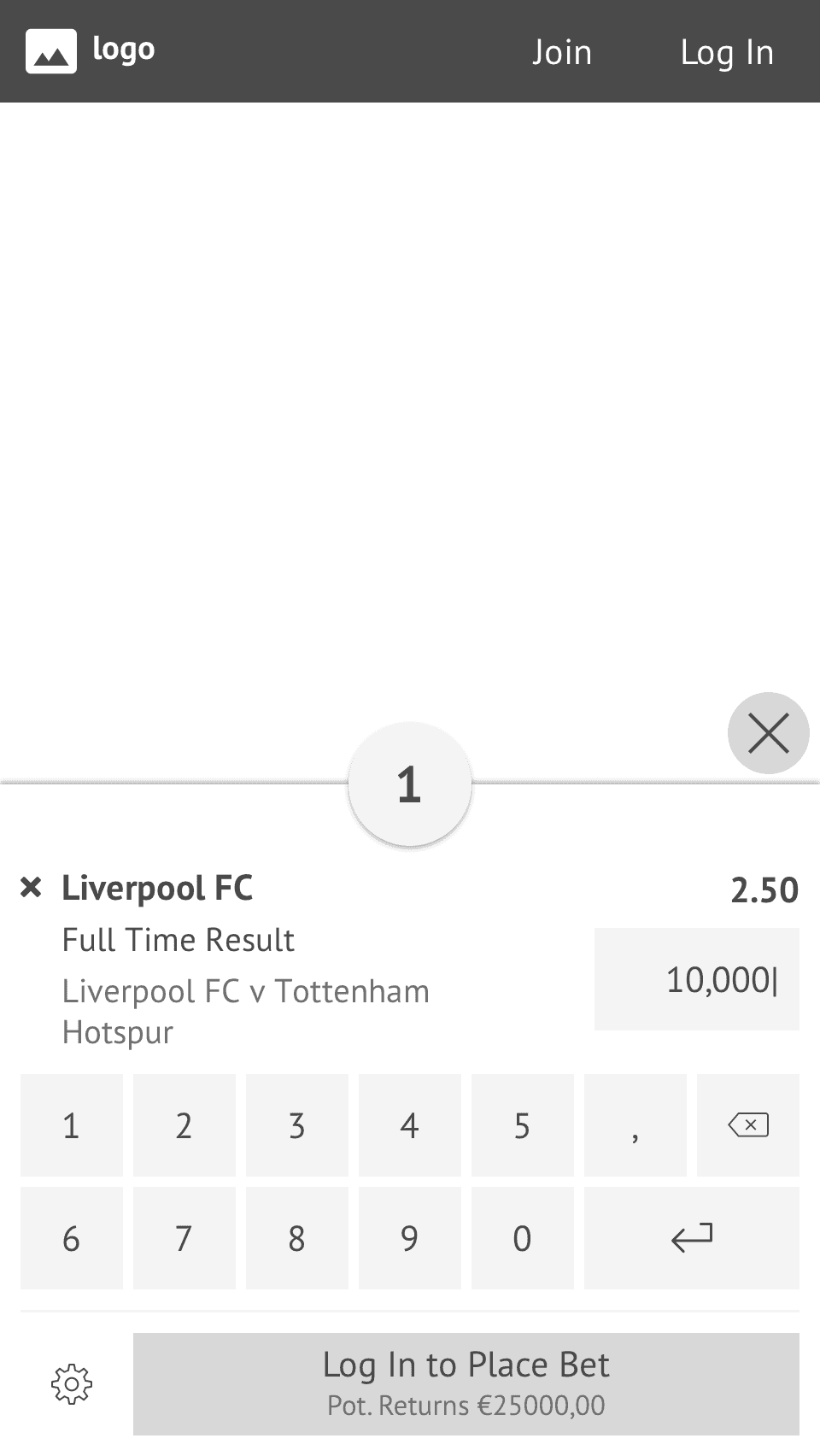
Once I had an understanding of what was demanded of the Quick Single Betslip I was able to create wireframes. This was done on paper and later on, high-fidelity wireframes were created in Sketch. Here I was aiming for a simple yet clear design that had all the important information displayed, yet still contained the critical information needed by some countries.
Prototyping
As we had laws we needed to abide by when it came to taxation there was two different prototype version that was created so that we could test out the usability of both.


User testing
Unfortunately, at the time we did not yet have the platform usertesting.com (something we got later on) which meant that the prototype testing was done internally. Since there were a lot of people that were betting outside of work as well we were able to do the user tests on them.
After a few iterations, a final design was concluded of the feature that we in the team were satisfied with.
Finalizing
Presenting the outcome
As with all other features I had done in the company, I presented the final wireframes to the stakeholders. To run the feature by them and to make sure that the developers were on board and could start planning their stories.
UX documentation
With every feature, I also wrote a detailed UX specification of the feature. This included everything from the placement of it on mobile versus desktop to what order the results should be presented in, tap targets and more.
Analytics
As with other features, we in the UX team made sure that we had the right analytics tracked. Not only the comparison between the regular betslip versus the quick one but also the features within the Quick Single Betslip.
UI Design
Once all the UX was done I created the designs for the Playtech Sports core sportsbook. This is the sportsbook that is the framework and base for all the customers. However, usually, my work stopped after having designed the feature in the core sportsbook and my UI colleagues made sure all the designs were in place for all the customers.
Below are examples of the feature from one of our customers. Check it out here (the feature is mobile only).


Post-live
QA
Once the feature was developed on the core sports book I made sure to test the feature so that it was working as intended.
After some months the feature was live on the demo site. This is when I went in to test the feature and make sure that it was working and looking as intended. If I found anything that was off I created bugs for the developers so that they could be fixed before going live to the customers.
Validation
Quarterly regression tests showed that goals were reached faster. While working at the company I used to run quarterly regression tests of the sportsbook on user testing.com. When comparing previous tests to tests once the search feature had been live for some time I was able to see an increase in the overall satisfaction of the user experience of the sportsbook and also users finding the events they were looking for faster than previously. This resulted in less frustration and better satisfaction with the entire website.
Key Learnings
I learned how to research and design a big and complex feature with a lot of detail to the different information that needed to be presented. As the feature was going to look slightly different due to taxation laws I learned the importance of detail and being able to include important information while keeping the designs clean.